Wisen IT Solutions

Master Interactive Data Visualization With Plotly

Turn Data IntoInteractive Insights

Learn to build interactive visualizations with Plotly in Python — from exploratory charts and dashboards to uncovering patterns, relationships, and data-driven insights.

Start Your AI-Paired Journey
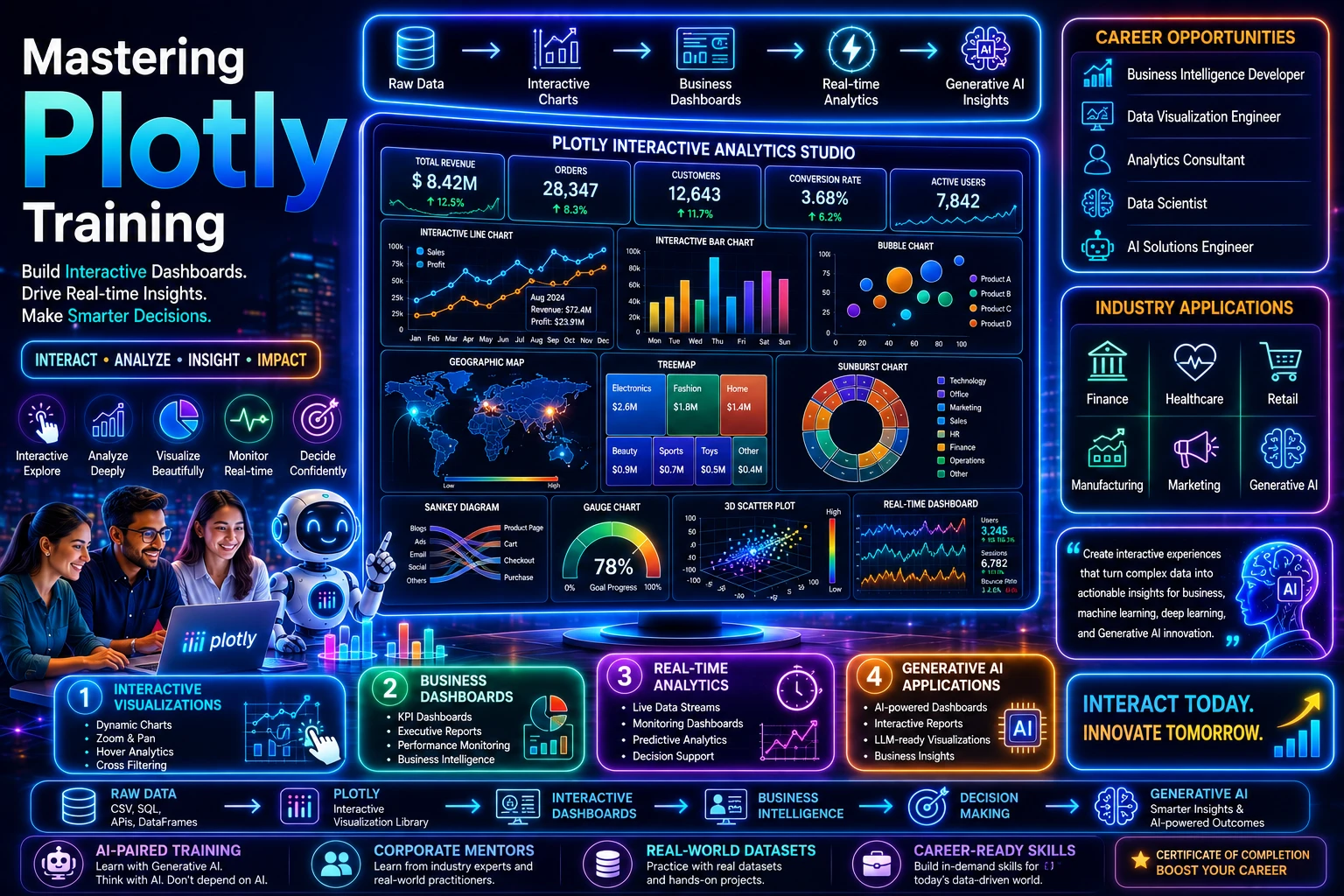
Plotly training in interactive charts, traces, hover interactions and dynamic data exploration at Wisen IT Solutions, Chennai, India
The Wisen Difference

Plotly Training for AI-Ready Interactive Data Visualization Careers

Plotly Training at Wisen, Chennai, India, develops practical skills for creating interactive data visualizations with Python. Learn interactive charts, figures, traces, subplots, layouts, annotations, hover interactions, statistical visualizations, customization, and dynamic data exploration through project-focused, AI-Assisted Learning for real-world data workflows.

  • AI-Era Interactive Visualization Skills
  • Project-Relevant Data Visualization
  • Interactive Python Visualization Workflows
  • AI-Assisted Visualization Development
  • Project-Ready Python Plotly Skills
  • 2,700+ Happy Students/Year

Build Problem-Solving Skills for the AI Era.Think Critically. Build Practically. Work with AI.

Wisen IT Solutions, Chennai, India

Interact. Visualize. Discover.

Plotly Course for the AI-Era

Build practical Plotly skills for the AI-Era through hands-on training in interactive charts, statistical visualization, dashboards, animations, 3D visualization, and web-based data storytelling. Learn to turn complex datasets into engaging interactive experiences, develop project-ready, AI-ready visualization skills, and open new AI-driven career opportunities in data analysis and visualization.

Chapter 01

Introduction to Plotly Topics

  • What is Plotly?
  • Interactive vs Static Charts
  • Plotly Ecosystem
  • Plotly Express vs Graph Objects
  • Installing Plotly
  • Rendering in Jupyter
  • Rendering in Browser
  • Renderers Configuration
  • Your First Interactive Chart
  • Figure JSON Structure
  • fig.show()
  • Saving as HTML
  • Static Image Export with Kaleido

Chapter 01

Introduction to Plotly Topics

  • What is Plotly?
  • Interactive vs Static Charts
  • Plotly Ecosystem
  • Plotly Express vs Graph Objects
  • Installing Plotly
  • Rendering in Jupyter
  • Rendering in Browser
  • Renderers Configuration
  • Your First Interactive Chart
  • Figure JSON Structure
  • fig.show()
  • Saving as HTML
  • Static Image Export with Kaleido

Corporate Plotly training for data teams at Wisen IT Solutions, Chennai, India

Moving Beyond
Traditional Training
with
AI-Enabled Learning.

AI-Ready Technology
Learning Lab

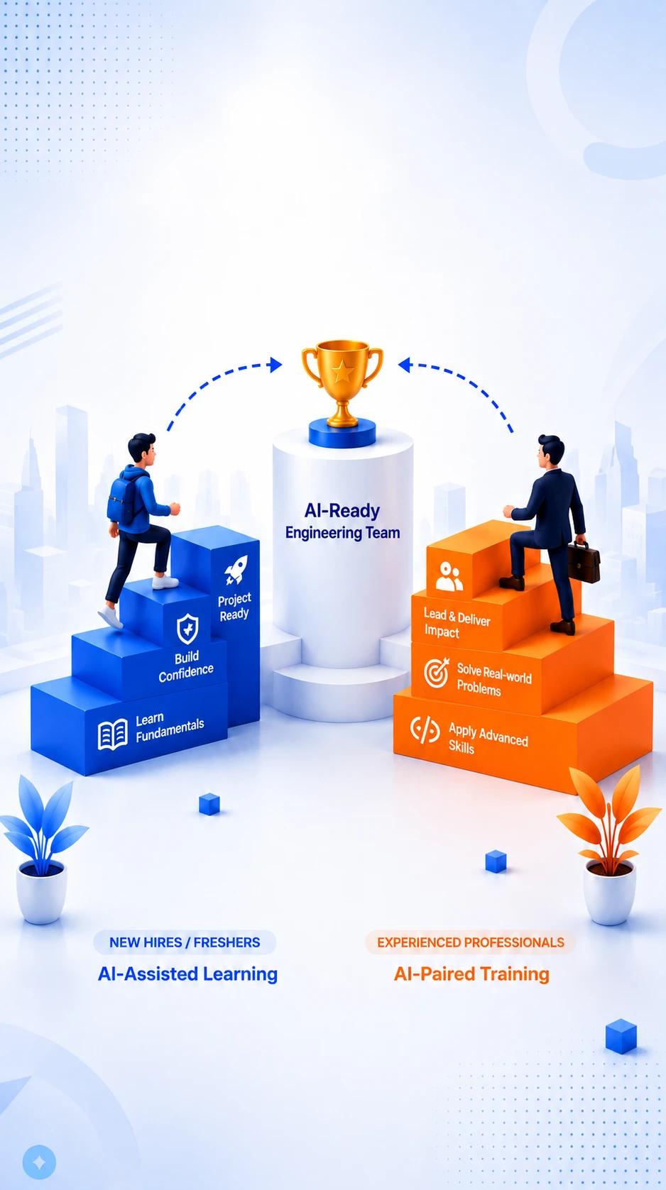
Moving Beyond
Traditional Training
with AI-Enabled Learning

For Organizations

Corporate Plotly Training

Build practical interactive visualization capabilities through AI-Enabled Learning across Interactive Charts, Data Exploration, Dashboards, 3D Visualization, Statistical Visualization, and AI-Assisted Visualization Workflows. Wisen’s Plotly Training combines AI-Assisted Learning for understanding interactive visualization concepts with AI-Paired Training for practical application, enabling professionals to create interactive visual experiences and data-driven dashboards while retaining analytical thinking, design judgment, and ownership.

Industry-Relevant Visualization Skills

Develop practical Plotly skills aligned with modern analytics, interactive reporting, dashboards, and data-driven applications.

AI-Enabled Learning

Use AI to accelerate visualization design, chart selection, data exploration, dashboard development, and problem-solving without replacing human judgment.

Induction & Upskilling Programs

Build structured learning paths for new hires, freshers, and existing professionals developing or strengthening their Plotly skills.

Hands-On Interactive Workflows

Practice interactive charts, dashboards, statistical visualization, 3D visualization, customization, and AI-assisted visualization workflows.

Customized Corporate Programs

Align training with your team’s roles, datasets, dashboard requirements, technology stack, projects, and organizational objectives.

AI-Evaluated Skill Development

Evaluate practical progress through AI-assisted assessments that identify strengths, skill gaps, and areas for improvement.

Looking for a tailored Plotly training program for your organization? Let’s build the right learning journey for your team.

Explore Corporate Training Page
Interact. Explore. Explain.

Skills You Gain from Plotly Training

Build practical interactive visualization skills through a Plotly Course focused on interactive charts, exploratory analysis, visual customization, filtering, and insight communication. Learn to create engaging visual experiences that help users explore data, understand relationships, and discover patterns across analytical and AI-enabled workflows.

  • Interactive Visualization

    Create interactive graphics that allow users to explore analytical information dynamically.

  • Interactive Chart Selection

    Select appropriate interactive chart types based on the dataset, analytical objective, and audience.

  • Data-to-Visual Mapping

    Connect data variables and analytical questions to meaningful interactive visual representations.

  • Trend Exploration

    Use interactive charts to investigate changes, movements, and patterns across datasets.

  • Relationship Exploration

    Examine relationships between variables through interactive visual representations.

  • Multivariable Visualization

    Represent multiple dimensions of data together while maintaining visual clarity and analytical focus.

  • Interactive Filtering

    Enable focused exploration by filtering visual information according to categories, values, or user-selected conditions.

  • Hover-Based Analysis

    Use interactive hover information to expose additional data details without overcrowding the primary visualization.

  • Interactive Statistical Visualization

    Present statistical information through interactive graphics that support deeper exploration.

  • Dashboard-Oriented Visualization

    Organize multiple interactive visualizations into experiences suitable for analytical dashboards and reporting.

  • Visual Customization

    Refine layouts, labels, axes, annotations, legends, and interactive elements to improve usability.

  • Exploratory Data Analysis

    Use interactive graphics to investigate datasets, identify patterns, and generate analytical questions.

  • Insight Discovery

    Develop the ability to move from visual exploration toward meaningful analytical findings through Advanced Matplotlib Training practices.

  • AI-Assisted Visualization

    Use AI to explore visualization ideas, troubleshoot implementation, and improve interactive workflows while retaining ownership of analytical decisions through Plotly Full Course learning.

  • Interactive Insight Communication

    Communicate analytical findings through engaging visual experiences while applying Python Plotly Course techniques and Advanced Matplotlib Course concepts.

Career Transformation Starts Here!

These skills help you move beyond static charts toward interactive exploration and richer analytical communication. Build practical capabilities through Plotly Online Course learning and develop modern visualization workflows that support analytics, dashboards, research, and AI-enabled decision-making.

91-900 31 31 555
Learn. Practice. Master Plotly

Plotly Training Course Materials

Plotly Course learning materials with interactive chart notes, labs and exercises

The content of this Plotly Course draws on 27+ years of Python training and application development experience, refined through corporate Plotly Training programs, learner sessions, and interactive dashboards delivered to real users inside real organisations.

Every chapter, figure example, lab activity, and exercise in this Plotly Full Course is built around interaction — hover detail, zoom, selection, and callbacks — so you learn to design charts people explore, not static pictures that happen to be rendered in a browser.

What You'll Receive

Interactive Charting Notes

Explanations of figures, traces, and layout in Plotly Express and Graph Objects, written for self-study.

Guided Lab Activities

Labs that take a dataset to a fully interactive figure, then to a small multi- chart view.

Hands-on Exercises

Independent Python Plotly Course tasks on hover templates, facets, animations, and custom layouts.

Dashboard Walkthroughs

Worked examples that assemble several figures into a coherent, shareable dashboard view.

Progressive Learning Path

A route from your first Express figure to Graph Objects, styling, export, and advanced Plotly Course topics.

Revision and Reference Sheets

Concise references for trace types, layout keys, and the configuration options used most often.

What Makes Our Plotly Learning Materials Different?

27+ Years of Experience

Written by trainers who have built and taught data-driven interfaces for decades.

Human-Authored Content

Authored and maintained by the trainers running the live Plotly sessions.

Original Learning Materials

Created in-house — not the official examples with the labels changed.

Practice First

Every concept arrives with a figure you build, interact with, and refine.

Continuously Refined

Updated as Plotly evolves so the examples run on the version you install today.

AI-Assisted Quality Review

AI contributes grammar, readability, and presentation checks only.

Our Commitment

What is published here is exactly what we teach.

The Plotly topics on this website reflect the learning journey delivered in our live instructor-led online training. We follow the published sequence and extend it with further interaction patterns, dashboard techniques, and deployment insights whenever a batch benefits.

Experience DrivenPractice FocusedResults Oriented
Build. Review. Become Dashboard-Ready.

Plotly Course Evaluation

Plotly Training is assessed by an experienced trainer and, separately, by an independent AI evaluation of your figure code. Interactive charts fail differently from static ones, so both reviews look at behaviour as well as appearance.

A Plotly figure has to hold up while someone hovers, zooms, filters and resizes it. This Plotly Course evaluates whether your charts stay correct and responsive under that use, not just whether they render.

Human Evaluation

Our experienced trainers evaluate your ability to:

Figure Structure

Explain traces, layout and the figure dictionary that sits under every Plotly chart.

Express vs Graph Objects

Choose between Plotly Express and graph objects with a reason you can state.

Interaction Design

Configure hover text, legends, selections and zoom so they help rather than distract.

Layout Control

Build subplots, axes and annotations that survive a change in screen size.

Data Binding

Map DataFrame columns onto traces without silent type or ordering surprises.

Debugging Figures

Track down blank charts, broken hover data and rendering issues across environments.

Dashboard Composition

Assemble several figures into one coherent view.

Export and Embedding

Produce HTML, static images and embeds that work outside your notebook.

Delivery Readiness

Ship an interactive chart that another person can use unaided.

Independent AI Evaluation

Our independent AI evaluation reviews your Plotly programs to assess:

Concept Application

Verify correct use of traces, layout properties and update patterns.

Figure Logic

Analyse how data flows from the DataFrame into each trace.

Plotly Practices

Evaluate adherence to current Python Plotly Course conventions.

Code Quality

Review structure, repetition and the separation of data prep from figure building.

Interaction Defects

Identify broken hover templates, mis-scaled axes and unresponsive layouts.

Payload Size

Suggest ways to reduce figure weight and speed up rendering in the browser.

Best Practices

Recommend improvements based on modern interactive-visualization practice.

Dashboard Readiness

Evaluate whether the figure is fit to embed in a real application.

Why Dual Evaluation?

Human trainers evaluate the experience your chart gives the person using it.

AI independently reviews the figure code, its structure and its rendering cost.

Together they judge an interactive chart the way its audience and its maintainer would.

Learning Outcome

By combining Human Evaluation with Independent AI Evaluation across the Plotly Full Course and our Advanced Plotly Training modules, you will:

  • Reason about figures as traces plus layout, not as opaque calls
  • Design interactions that add information instead of noise
  • Keep interactive figures fast on realistic data volumes
  • Export and embed charts reliably outside the notebook
  • Become project-ready for dashboard, reporting and analytics product work
AI-Assisted Interactive Charting

Plotly Course Duration & Batch Timings

Plotly Training runs live from Wisen IT Solutions, Chennai in two batch paces, giving every learner enough hours to build interactive charts and dashboards rather than only view them.

Total Learning Hours

35 - 40 Hours

Instructor-led interactive sessionsFigure and callback practiceDashboard labsDeployment project work

Normal Track

2.5 Hours / Session

A steady pace with time between Plotly Course sessions to extend your own dashboards.

  • Working Professionals
  • College Students
  • BI Practitioners
  • Weekend Batches

Fast Track

5 Hours / Session

A rapid route through the Plotly Full Course for learners free during weekdays.

  • Full-time Learners
  • Job Seekers
  • Fresh Graduates
  • Product Analysts

What's Included?

Live Instructor-Led Training

Interactive Figure Learning

Hands-on Plotly Coding

Dashboard Lab Activities

Layout & Callback Exercises

AI-Assisted Learning

Independent Chart Evaluation

Doubt Clarification

Publishing & Sharing Guidance

Same Curriculum |
Same Labs |
Same Evaluation |
Same Learning Outcome

The Advanced Plotly Course syllabus does not shrink on the Fast Track — every Python Plotly Course batch builds the same dashboards and meets the same evaluation standard.

Balanced Learning. Interactive Practice. Shareable Dashboards.

Lecture-Practical Ratio

An interactive chart cannot be judged from a slide — it has to be hovered, zoomed and filtered. This Plotly Course therefore runs on a 50:50 Lecture-Practical Ratio, with every trace, layout and callback concept driven live in the browser as it is taught.

The Plotly Training has you wire up your own interactions and publish the result, so the Advanced Plotly Course ends with dashboards you built rather than examples you copied.

50%Theory

Understand the figure spec that drives every Plotly chart.

  • Traces, layout and the figure object
  • Plotly Express versus graph_objects
  • Interaction and event model
  • Templates and theming
  • Dash callback architecture
  • Rendering and export options
50:50Balanced Learning

50%Practical

Build and interact with live figures in every session.

  • Live interactive charting demos
  • Express and graph_objects labs
  • Hover, zoom and selection exercises
  • Subplot and multi-trace practice
  • Animation and slider building
  • Dash dashboard assembly sessions
  • AI-assisted dashboard review exercises

Why a 50:50 Split Works for Plotly

Understand the Figure Spec

Every chart is a dictionary you can read and edit.

Interact While Learning

Hover and zoom behaviour is checked in the browser, not assumed.

Wire Real Callbacks

Dash only clicks once you have connected input to output yourself.

Test Responsiveness

See how your layout holds up at a smaller width.

Publish Something Real

Finish the Plotly Full Course with a dashboard you can share.

Our Learning Philosophy

Every Plotly concept is followed by an interactive figure you build and drive.Wisen IT Solutions, Chennai runs this Python Plotly Course on the principle that interactivity is learned by using it, not by watching a recorded demo of it.

No Web Skills Needed. Interactive Charts From Python Alone.

Plotly Course Prerequisites

This Plotly Course asks for basic Python and nothing more. Interactive figures, hover behaviour, traces and layouts are built entirely from Python — no HTML, CSS or JavaScript is required of you.

The Plotly Training is live online, and the Advanced Plotly Training material in the Plotly Full Course is reached from the same first interactive chart you build in session one.

Basic Python

  • Lists and dictionaries
  • Nested dictionaries as configuration
  • Importing a library and calling a function
  • Running a notebook cell

Interest In Interactivity

  • Curiosity about hover, zoom and filtering
  • Thinking about who will read the chart
  • Willingness to iterate on a layout
  • Commitment to the dashboard lab exercises

Interactive Setup

  • Windows OS with a stable internet connection
  • A modern browser for rendering figures
  • Python 3.x with Plotly installed in class
  • Jupyter Notebook or VS Code notebook support

Who Can Join?

Students & Graduates

Dashboard & BI Users

Business & Product Analysts

Python developers adding interactive reporting

No Front-End Experience Required

You do not need any web-development background to take this Python Plotly Course. Every interactive figure, subplot and exported HTML dashboard in the Advanced Plotly Course material is produced from Python code we write together.

All you need is basic Python, a browser and data you want people to explore.

We’ll take care of the rest!
Interactive By Default. Shareable In A Browser.

Plotly Course Tools & Technologies

This Plotly Course covers both entry points — Plotly Express for fast exploration and graph_objects for full control — plus the figure schema underneath that makes the two interchangeable.

The Plotly Training then moves into callbacks and Dash, so charts become an application someone else can use. That step is what separates an Advanced Plotly Course from a gallery walkthrough.

Plotting APIs

Plotly Express

graph_objects

Figure Schema

make_subplots

Templates & Themes

Chart Families

Time Series

Scatter & Bubble

Choropleth & Mapbox

3D Surface & Mesh

Candlestick & OHLC

Sankey & Sunburst

Interactivity

Hover Templates

Zoom & Pan Controls

Animation Frames

Buttons & Sliders

Cross-Filtering

Apps & Sharing

Dash

Callbacks

Standalone HTML Export

Static Export with Kaleido

Notebook Rendering

Learning Outcome

By the end of this Python Plotly Course you can turn an analysis into an interactive dashboard a stakeholder opens in a browser and explores without you in the room — the working outcome of the Plotly Full Course.

Explore in Seconds

Control the Figure

Add Real Interactivity

Ship a Dash App

Got Questions - Quick Answers

Plotly Training Frequently Asked Questions

27+
Years of Experience
17,700+
Professionals Empowered
2,700+
Happy Learners Every Year
30+
Corporate Clients

Corporate Training Clients

A Trusted Training Institute Upskilling Teams at Leading Companies Worldwide

A Wisen IT Solutions Python training advisor pointing towards the enquiry number

Build Future-Ready Skills. Gain Project-Ready Experience.
Succeed in AI-Transformed Careers.

The software industry is evolving with AI—not disappearing. Wisen's AI-Enabled Learning helps you master modern technologies, build strong engineering fundamentals, and collaborate effectively with AI tools like ChatGPT and Claude. Develop the practical skills, critical thinking, and real-world experience needed to build software with confidence and remain valuable throughout your career.

Talk to our AI Learning Advisor

+91 900 31 31 555